My learning – I | Confluence
Post the work from home arrangement that we announced in our company, we took to different methods figuring out the flowing transparent communication across teams.
One of the most wanted situations being an effective digital workplace where teams can share knowledge and collaborate with absolute transparency. (This is not version 1 that we were building of course. We are a 10-year-old company and we have seen multiple versions already however, since necessity is the mother of invention “best version”, every team took to creating a good documentation or written guidelines to help one another. We use confluence as one of our documentation enterprise software and earlier when everyone (including me) thought of it as a engineer first tool and just a basic platform for us to capture only important policies and guidelines etc., all of us (from engineers to everyone else) now propelled our thought of it being the new digital workplace!
If your company doesn’t use confluence, there are other good tools too but the core being a common place for all to collaborate.
Things to keep in mind, while building a kick ass landing page with the confluence editor :
- Layout – The page layouts tool allows you to structure your page using horizontal sections and vertical columns. By adding multiple sections with different column configurations you can build quite complex layouts very easily.
- Images – Documents are boring and adding images adds in life and more engaging.
- Alignment – Makes the page more appealing
- Dynamic Content – Tells the updated story.
Here is an example of a team landing page all the above:
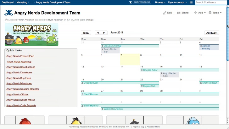
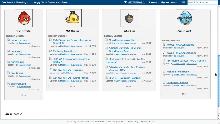
Things to note here: The page is divided into 2 sections – top and bottom. Also the top section has 2 columns – one with image and the quick links and the calendar and the bottom section has 4 columns.
Learnings Macros : (Easiest way to learn them is to use the autocomplete)
Section
Column
Panel
Team Calendar
Multiple media and images
Start a new page and visualize on the content and alignment.
- LAYOUT:
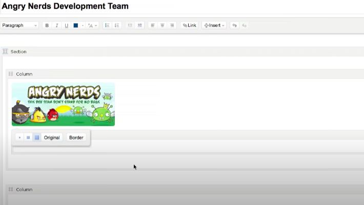
Step 1: – Divide to the two- top and bottom sections by inserting the macros. If you notice these are actually placeholders and not the curly brackets of macros so it helps you keep your imagination more real.
Step 2: Add the column macros inside the sections. Example to build the above page we insert 2 columns in the top and 4 in the bottom.
Step 3: Add in the panel macros inside the columns to add the content and also highlight the page really well.
2. IMAGES:
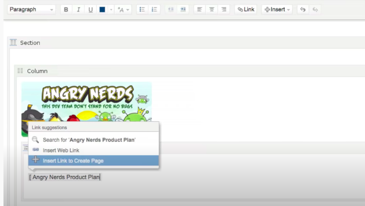
Step 1: Keep the images handy on your desktop or folder. Drag and drop the image inside the column macros right above the panel macros to see the angry nerds image exactly the way it looks.
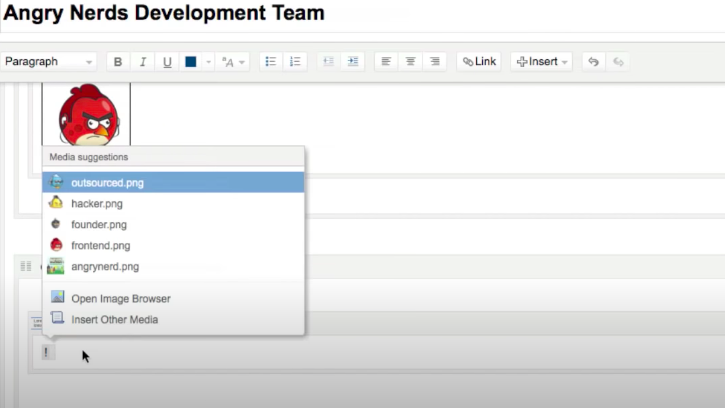
Trick to insert multiple images: Click on insert and upload file from the desktop and drag up to 4 images together to insert them and use autocomplete. Type “ ! “ to view the autocomplete media and use them to insert them one after the other in the 4 columns inside the panel and give them a border.
3. ALIGNMENT:
STEP 1: Add the name beneath the images added and select the image and the name together and hit the centre alignment. Once the position of the highlighted text/image changes, we get to also visualise better on how the page would look.
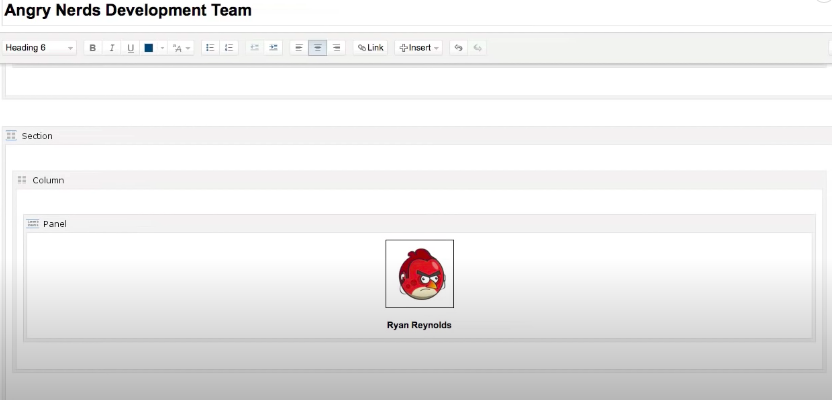
4. DYNAMIC CONTENT:
STEP 1: Go to the top section and inside the panel start adding some quick links by starting with a square bracket. Confluence allows you to create links of pages that do not yet exist – dead pages! 🙂 This is a good feature to always come back later.
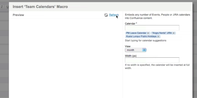
Step 2: Next one in the top section is a team calendar. Start with the curly brackets and typing team calendar and it auto fetches it from your company. It also allows to add multiple calendars. Add the monthly view and hit refresh.
STEP 3: The last thing in the dynamic macro is going back to bottom section inside panels start typing the recently updated files macros and hit enter.
There are many more macros and plugins and this is just part one of my learning on building pages and we can cover more in the future posts. Another cool thing that the team has developed is some amazing ready to use templates for everyone and I just loved it and their support. How come no one has ever never mentioned it to them.
